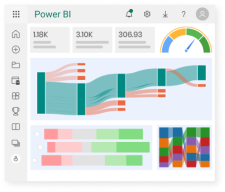
Power BI is… something beyond a reporting tool. It is hard to visualize its scope from seeing a report.
First of all, it is a visualization tool not a reporting tool. The reporting part of Power BI is called Paginated Reports. These are line-item reports that someone might want to print or send as a PDF will lots (thousands, millions?) of rows.

This is a spin off of the SQL Server Reporting Services (SSRS) that was used on-premises and is still available on-premises. There is even an on-premises SSRS for Power BI reports.
Second, there is an Online Analytical Processing (OLAP) database service under the hood. It comes from SQL Server Analysis Services (SSAS) that was used on-premises as a Multidimensional engine. The Tabular engine came from xVelocity (In-memory/compression) first placed into Excel as Power Pivot.

Then, there is the rest – DataFlows, Capacities, Admin portal settings, Data Mart (still in Preview, probably going away), Metrics, etc. These are options in the service (internet) that can perform ETL or ELT (DataFlow), control access to features (tentant settings), format data in the service as a dimensional model (Data Mart) and create Scorecards (Metrics).
With Fabric coming on board, we need several more articles to cover all of that.
That being said, below is a chart the someone (Melissa Coates) created to start to see the progression of features in Power BI. It start small…

Because of the overwhelming options, we should always start with requirements. What business need are we trying to handle? How can we get a measurable result to show the strength of Power BI?
Below is the last time this person update her diagram:

So, that being said, please realize Power BI has come a long way in 9 years. With Fabric, there are many more years of improvements and features. They will try to satisfy Business Intelligence requirements as well as brazing a path to integrate AI into this wonderful tool of tools.

