Thank you Microsoft for porting Power BI reports to SQL Server Reporting Services (SSRS). This goes along way with IT shops that are still On-Premise. There is no denying that more development is going to Azure. Some IT departments I have networked with are using a Hybrid approach – new stuff not under regulation can go to Azure, but current running application reports new this option for Power BI with SSRS.
Using Power BI reports with Reporting Services is a great addition to have and we are thankful Microsoft has provided this option. Here are some Top Features available On-Premise (these could change next week 🙂 ).
Pie Charts
I like to use Pie Charts as Slicers (filters) to other visualizations. This is nice when there are hierarchies like Product Category to Subcategory. You can have 2 Pie Charts that show a measure as well as filtering.

Edit Interactions
This is such a necessity for filtering that controls the effect of selecting a bar on a Bar Chart and the changes to other visualizations on the report. There are really 3 options: No effect, full effect and partial effect. To access, go to the Format tab, then click Edit Interactions on the top left.

Then, one visualization has to be selected, like a bar graph, then a related visualization, like a clustered bar chart, can have the interaction filter change. The default is the partial or highlight filter.

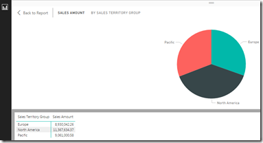
See Data
This is so cool, but I have seen a new custom visualization trump this (hint: Tree View). The see data option helps list the data behind the visualization. Right-clicking the slice in a Donut Chart will give a menu for See Data.

Then, a table appears with the visualization with a Back to Report button on the top left. So cool!!!

Matrix (and Table)
The Matrix (and Table) provide details to the visualizations. This enables standard type of line reporting to be included in Power BI reports. The matrix gives the cross tab (Pivot) report while the Table is a list.

Connect Live to Analysis Services (Model or Perspective)
Not sure why there are so many demos of Power BI that show selecting a spreadsheet or table/view that has flattened data to import into Power BI when users can use an existing Analysis Service (SSAS) database to do all the centralized Business Rules. The measures in an SSAS database can help company’s isolate the rules for calculations and force users to retrieve that data from one source. Time and time again I see reports with various T-SQL statements that have slightly different logic to pull data for the same calculations.

SSAS database can get big, but developers of OLAP database should remember the use of Perspectives (like table views for relational database developers) that can limit the Attributes an end user sees.

Here are just a few of the nice features for On-Premise Power BI Reports in SSRS. There are many more and as we start to deploy them, I will update additional blogs with those we really like.

