These is a new format for viewing dashboards/reports in the Power BI service. Luckily, you have a button to turn it on and off (for now).

Figure 1 New Look On/Off button
I am glad to have the switch toggle in order to see the before and after. I am sure Microsoft is going in the right direction with this but it seems that blogs and books are going to have a problem adapting to the changes. Not sure how all that plays out, but I am sure it will smooth out after a couple of months.
New Features
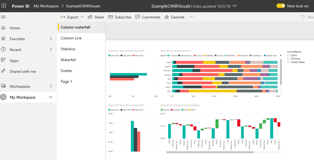
Navigation has been moved to the side vertically with the ability to resize. There is more canvas for displaying reports.

Figure 2 Navigation Pane
There is additional information about the workspace and data like last refresh date. The icons and themes have been defaulted to something more appeasing to the eyes.
About a month ago, there were changes to the Filter experience. Now, the new experience is in the service with the addition of popups for filters.
The tool/action bar has been updated to the more frequently used buttons with a ellipse to get to the rest.

Figure 3 New Tools Access
Start playing around with turning it on and off and enjoy the change (and more work to be done)!!!

Figure 4 NICE!!!

